Using CSS to display a gallery of images is a relativly simple preocess. The first thing we do is import all of our images into our HTML file like this.
1
2
3
4
5
6
7
8
9
	<div id="images-wrapper">
	  <img src="path/to/your/img0.example" alt="picture 1">
	  <img src="path/to/your/img2.example" alt="picture 2">
	  <img src="path/to/your/img2.example" alt="picture 3">
	  <img src="path/to/your/img2.example" alt="picture 4">
	  <img src="path/to/your/img2.example" alt="picture 5">
	  ...
	</div>
However, we have a problem... All of our images have different aespect ratios! This can be a bit challenging as a simple grid layout won't really cut it, since each image has varying widths and heights. This leaves ugly whitespace all over your gallery, like this.
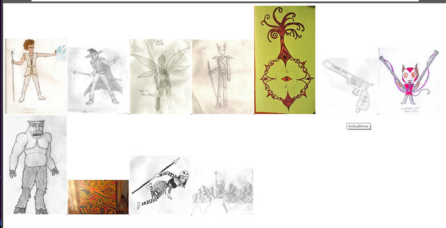
What an embarrasing mess of whitespace! Nobody wants to look at that! For shame!
But don't despair, there is a simple CSS solution! We want to have all of the images automatically arranged so that there is no whitespace between them, regardless of their aespect ratios. In this article, we'll look at a CSS technique that will allow us to simply stack our images into uniform vertical columns, keeping all of their widths the same, but allowing their heights to change depending on their aespect ratio. We will use the CSS3 property column-count that will output all of our images into a specified number of columns.
The column-count property is usually used to format text into columns of equal width, but it works just as well for images too. Here is the CSS
1
2
3
4
5
6
7
8
9
10
11
12
13
14
15
16
17
18
19
	#images-wrapper {
	  line-height: 0;
	  -webkit-column-count: 5;
	  -webkit-column-gap:   0px;
	  -moz-column-count:    5;
	  -moz-column-gap:      0px;
	  column-count:         5;
	  column-gap:           0px;
	}
	#images-wrapper img {
	  width: 100% !important;
	  height: auto !important;
	}
	#images-wrapper{
	  display:inline-block;
	  margin-right: auto;
	  margin-left: auto;
	}
This will stack all of the images into 5 columns, resizing their width as necessary but allowing their height to adjust naturally with their aespect ratio, resulting in something like this.

The result is much less jarring to look at without all of that ugly whitespace between the images! And of course we need to think about responsive design as well. For a responsive mobile gallery, we can use @media queries to change the number of image columns depending on the width of the screen.
1
2
3
4
5
6
7
8
9
10
11
12
13
14
15
16
17
18
19
20
21
22
	@media (max-width: 1000px) {
	 #images-wrapper {
	 -moz-column-count:    3;
	 -webkit-column-count: 3;
	 column-count:         3;
	 }
	}
	@media (max-width: 800px) {
	 #images-wrapper {
	 -moz-column-count:    2;
	 -webkit-column-count: 2;
	 column-count:         2;
	 }
	}
	@media (max-width: 400px) {
	 #images-wrapper {
	 -moz-column-count:    1;
	 -webkit-column-count: 1;
	  column-count:         1;
	 }
	}
this will reduce the number of columns to 3 on screens that are 1000px or less, and further reduce to 2 on screens that are 800px or less, and only one column for small smartphone screens less than 400px wide.
And that's how you get rid of white space between images of varying aespect ratio sizes in a responsive fluid layout! Feel free to look at the galleries on the portfolio page of this website to see examples of this method in action, and if you want to read more about seamless image galleries, read this great article by Chris Coyier